UI Problems
Weak visual hierarchy, Spacing issues, Inconsistent components, Inconsistent color usage.
Leonardo case study
Leonardo is a mobile app for managing home automation systems with simplicity and precision. The product was already functional, but its UI and UX were not clear enough. My work focused on restructuring the interface, improving the user experience while respecting strict technical constraints.
The real problems
The main challenge was not inventing a new product from scratch. It was making an existing product easier to understand, more consistent and more professional while changing as little code as possible.
Weak visual hierarchy, Spacing issues, Inconsistent components, Inconsistent color usage.
Confusing navigation, Unclear states to activate and deactivate zones and areas, Lack of onboarding, Inconsistent interaction patterns, Unreadable status indicators, Unclear Error states
The client wanted to improve the product while changing as little code as possible, no flow restructuring, no deep logic changes, no heavy technical refactor.
The old interface exposed the main features, but hierarchy, status recognition and visual consistency were weak. Users had to interpret too much instead of being guided by the interface.
The main menu listed every module as a flat row of items, with no visual hierarchy between priority actions like the alarm and secondary settings.
Each area could turn one of 4 different colors depending on its state, but no legend explained what they meant. Users had no way to tell whether an area was armed, disarmed, partially armed or ecluded.
Each switch relied on color alone to show its state. Without labels or icons, recognizing on/off meant memorizing what red and green meant here.
Zones used the same 4-color status system as areas, again with no legend to explain it. On top of that, every zone was rendered as an identical card in one long, ungrouped list that became an endless scroll.
Camera feeds appeared as small, low-contrast thumbnails with inconsistent naming, making it hard to identify a specific camera at a glance.
The event log was a dense, undifferentiated list. Critical alerts had the same visual weight as routine entries, so nothing stood out.
System settings sat in a generic list of rows with arrows, all styled the same way, with no cue for which options were used most often.
Product audit
Because budget and development flexibility were limited, the analysis focused on practical improvements: visual hierarchy, consistency, state readability, color meaning and screen comprehension.
Leonardo was already a functional home automation app designed to control alarms, domotics, zones, cameras and system events.
The product had value, but the interface was making that value harder to perceive and use.
The main problem was not the existence of the features, but their clarity.
Navigation, labels, visual hierarchy, spacing, states and screen composition were not helping users understand the system quickly.
The project had a very low budget and strict technical constraints.
The client requested a redesign that would improve the experience without deeply changing flows, architecture or app logic.
I focused on UI refactoring, visual hierarchy, color consistency, component rhythm, state readability and screen-level comprehension.
The goal was to make the existing product feel more reliable, coherent and easier to understand.
I introduced a missing splash screen and onboarding flow to make the product feel more complete from the first interaction.
I also refactored the visual language of the main screens to create a stronger black/yellow identity.
Process
This was not a blue-sky redesign. The process was built around what could realistically improve the product without forcing the client into a heavy development refactor.
I reviewed the current app screens to identify UI inconsistencies, weak hierarchy, confusing states and areas where users could misread the interface.
Before redesigning, I mapped what could realistically be changed without requiring a deep code rewrite or major flow restructuring.
I rebuilt the visual direction around a stronger black and yellow identity, improving contrast, coherence and perceived product quality.
I redesigned the main app screens with clearer hierarchy, more readable components and a more consistent interaction language.
I added the missing splash screen and onboarding, then refined key screens to make the app feel more complete and intentional.
The redesign was not only a visual reskin. I first mapped the existing app logic, then rebuilt the interface direction around clarity, state readability and consistency.
The lo-fi flow helped me understand how the app was structured, where the main screens lived and which interactions could realistically be improved without rewriting the product.
Before moving into high fidelity, I defined the core palette, type scale and onboarding illustration style. The goal was not to decorate the interface, but to make the product feel more coherent, more readable and less cold from the first interaction.
The yellow became the primary action and identity color, while the dark surfaces were cleaned up to create stronger hierarchy and better readability.
#FFBE2E #E3E3E3 #F1F1F1 #282828 #121212 The main brand and action color, used to guide attention and create a stronger product identity.
Used for descriptions, secondary labels and interface copy that should remain readable but less dominant.
Used for headings, important labels and high-priority content on dark surfaces.
Used for elevated surfaces, repeated modules and control areas with enough separation from the background.
Main foundation for the interface, chosen to reduce visual noise and create a stable dark environment.
The five boxing wizards jump quickly.
The five boxing wizards jump quickly.
The type scale was kept compact and predictable: enough hierarchy to guide the user, without making dense operational screens feel oversized.
Header1
Header2
Header3
Header4
Body
Subtitle
Little info
The onboarding illustrations were introduced to make the app feel less cold and less purely technical, creating a softer first experience before users reached the operational control screens.
The hi-fi flow shows the redesigned direction applied to the complete interface system: login, onboarding, control panels, zones, areas, notifications and TVCC management.
Each area or zone used a color to communicate its status, but there was no legend, no label and no explicit explanation. The user had to guess what each color meant.
When the system contained many areas or zones, the interface became long and tiring to scan. A better mobile solution would have been horizontal pagination or swipe-based access.
I would have chosen a mobile-first pagination model, but the product team required a more desktop-like pagination pattern. I accepted the compromise to stay within project constraints.
I strongly pushed for a search bar to let users find areas, zones and devices by name. The idea was rejected because it would have required too many code changes.
The final result improved the product significantly, but it is not the version I would have released with full design and technical freedom. This was a pragmatic redesign shaped by real business, budget and development constraints.
Final solution
The final result did not rely on heavy animations or complex new flows. The value came from a more coherent visual system, stronger hierarchy, better state readability and a clearer product identity; introducing a stronger black/yellow identity, clearer cards, better visual hierarchy, explicit state labels and a more consistent design language across the main screens.
Onboarding flow
A guided onboarding now walks first-time users through adding their control unit by name and ID, something the old app never explained up front.
The PIN-based access flow is introduced early, so users understand how login works from their very first session instead of figuring it out by trial and error.
Areas are introduced as a core concept right away, preparing users for the configuration screens before they ever have to open them.
Zones are explained as items that can be activated or excluded within each area, setting expectations for the state-based controls used later in the app.
The tutorial closes by introducing smart-device management, giving new users a mental model of the whole app before they ever land on the dashboard.
Access flow
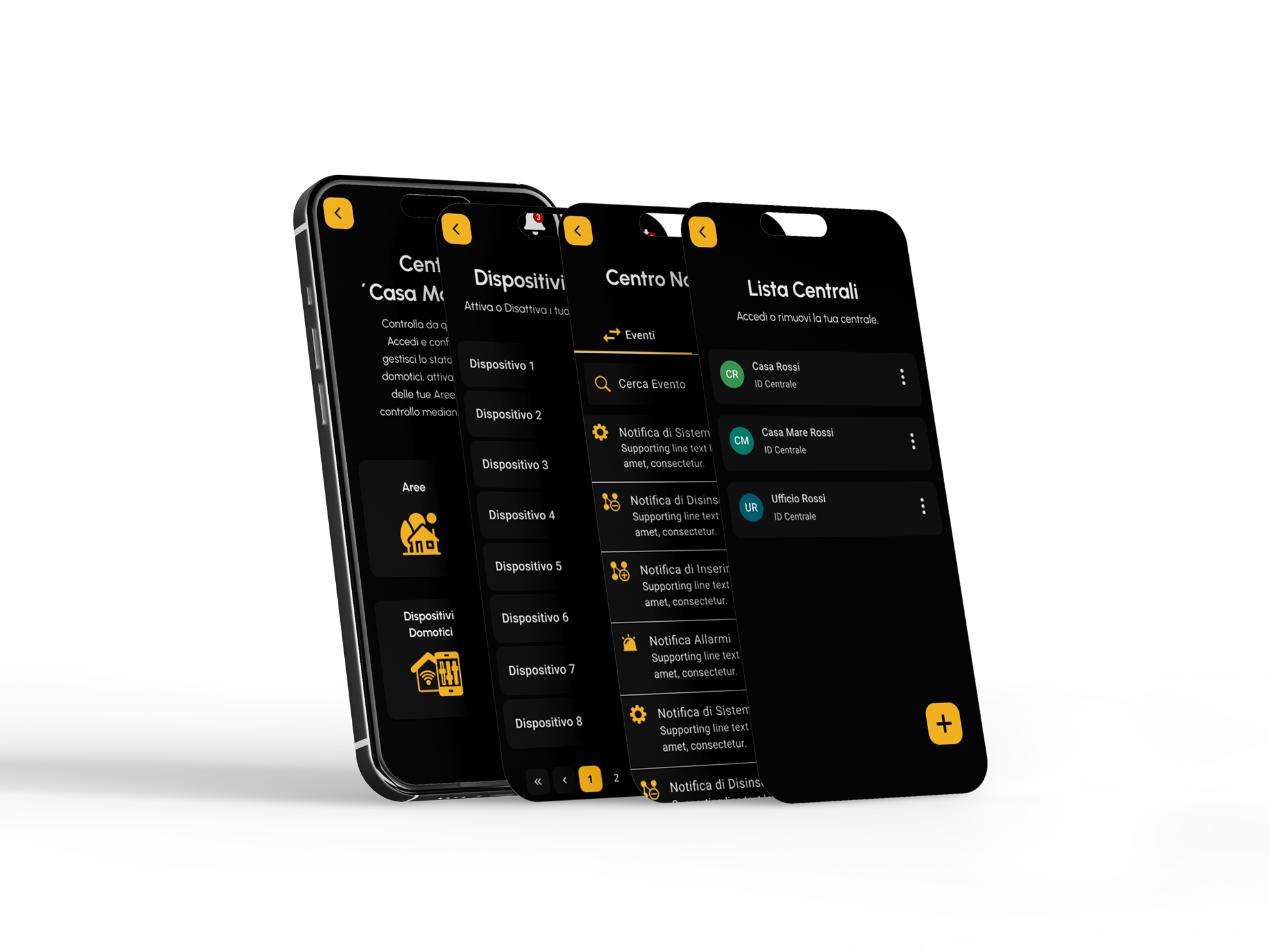
Each control unit now appears as a clear card with its own status icon and name, replacing the flat, unstructured menu of the old home screen.
Accessing a control unit now goes through an explicit, branded PIN screen with a 'remember access code' option, making the security step visible and predictable.
A dedicated security notice explains exactly what 'remember access code' means and for how long, so users make an informed choice instead of guessing.
Control panel flow
The old flat menu was replaced with a clear hub of four labeled sections - Areas, Zones, Outputs and Cameras - so users immediately see what they can control from this unit.
Each area now shows its state through an explicit toggle, label and checkmark/cross icon, replacing the old system.
Every zone now pairs a colored status dot with a text label like 'Chiusa' or 'Isolata', and the long list is split into pages instead of one endless scroll.
Output devices use the same toggle-plus-icon pattern as areas, so on/off states are readable at a glance instead of relying on color alone like the old activation switches.
The notification center separates events from errors with tabs, adds search and filtering, and gives each entry a category icon, so critical alerts no longer blend into routine log entries.
Introduced a missing entry moment to make the product feel more complete, branded and intentional.
Added a clearer first-use experience to explain the product and reduce the cold-start feeling of the previous app.
Rebuilt the visual language around a more coherent dark interface with yellow as the main action and attention color.
Improved titles, spacing, card structure and visual weight so users could understand each screen faster.
Made zone and system statuses more readable through stronger state indicators and clearer action affordances.
Refactored repeated components to feel part of the same system instead of isolated screens with different rules.
Adjusted contrast, typography, spacing and component density to make the app easier to read in daily use.
The redesign respected the client’s constraint: improve the product while avoiding unnecessary technical disruption.
Outcome
The hardest part was not identifying the problems. They were visible from the beginning. The real challenge was improving the product inside strict limits: low budget, reduced technical flexibility and minimal flow changes. Leonardo became a more coherent, readable and professional home automation app without requiring a full rebuild.
Get it on Google Play