WHAT
What problem are we trying to solve?
We're trying to simplify the management of a complex security ecosystem that includes anti-intrusion systems, IoT integrations, video verification, cloud services, smartphone control and smart-home features.
I got in contact with Fabio, the product owner of Elmax, through a mutual friend. Fabio needed to restructure his home automation app, both UI and UX, and wanted it aligned with the standards and best practices adopted by his competitors. Having a Google UX certification, I proposed a full design process covering all five phases: Empathize, Define, Ideate, Design and Test.
Due to budget and time constraints, Fabio opted for the Prototype phase only. He needed an app ready for the app stores as quickly as possible, aligned with the conventions already established by competitors.
This caught me off guard. I'm used to designing from research data and organised insights; without them, the creative process becomes considerably harder. But it was a compelling challenge, and I didn't want to pass it up. I accepted.
I still had to analyse competitors, understand how home automation systems work, and identify the best practices in the field: essentially a form of reverse engineering to compensate for the missing UX phases.
After several intermediate calls with Fabio and multiple prototype iterations, we reached a shared outcome: the app met the brief, the client was satisfied with the visual design, and the experience was intuitive to use. Personally, I wasn't completely satisfied: I would have pushed further, iterated more. But in the end the product wasn't mine, and chasing perfection indefinitely isn't always an option.
Designing without data: bridging the gap through reverse engineering and competitive analysis.
Understanding the challenges faced by users managing complex security ecosystems, including alarms, IoT, remote control and smart-home features, to design a clearer and more intuitive experience.
Before starting to design, I clearly defined the problem to solve using the 4W+H framework: who, what, why, goal, and how.
4W + H
We're trying to simplify the management of a complex security ecosystem that includes anti-intrusion systems, IoT integrations, video verification, cloud services, smartphone control and smart-home features.
We're solving this for private users, businesses and installers who need to configure, monitor and control Elmax systems in a clear, reliable and intuitive way.
Because security products often involve technical complexity, but the user experience should feel simple, safe and immediate. The interface needs to reduce friction, support daily use and make advanced features easier to understand.
To create a clearer digital experience for managing alarms, areas, zones, devices, notifications and smart-home integrations, while keeping the system trustworthy and easy to use.
By restructuring the app experience around intuitive flows, clearer information architecture, simplified controls and consistent UI patterns that help users move confidently between security, monitoring and connected-home actions.
Empathize
Research was the foundation for understanding the competitive landscape and identifying where Elmax could create value. I focused on quantitative research, while qualitative research was mapped but not conducted.
For this project I focused on quantitative research: competitor analysis and feature comparison.
I analysed the main competitors in the security and smart-home sector to understand which features are already standard and where Elmax can add value. The focus was on comfort features such as thermostat, blinds, scenes and voice assistants.
| Feature |  |  |  |  |  |  |
|---|---|---|---|---|---|---|
| Thermostat control | ✓ | × | × | ✓ | ✓ | ✓ |
| Temperature management | ✓ | × | ✓ | ✓ | ✓ | ✓ |
| Shutter control | ✓ | × | × | ✓ | ✓ | ✓ |
| Area management | ✓ | ✓ | ✓ | ✓ | ✓ | ✓ |
| Zone management | ✓ | ✓ | ✓ | ✓ | ✓ | ✓ |
| Notifications | ✓ | ✓ | ✓ | ✓ | ✓ | ✓ |
| Scene creation | ✓ | × | × | ✓ | ✓ | ✓ |
| Remote control | ✓ | ✓ | ✓ | ✓ | ✓ | ✓ |
| Voice assistant integration | ✓ | × | ✓ | ✓ | ✓ | ✓ |
| Mobile app (iOS / Android) | ✓ | ✓ | ✓ | ✓ | ✓ | ✓ |
✓ Feature available · × Not supported or only via external integration.
Key takeaway
Many platforms manage alarms and zones well, but only a subset offers a complete experience for comfort control in a single app. This is where Elmax can differentiate.
Classification of recurring problems found in competitor app reviews, grouped by theme.
| Issue category | What users reported |
|---|---|
| App stability & bugs | Crashes after updates, slow performance, missed notifications |
| UI/UX problems | Poor readability due to fonts or contrast, unintuitive interfaces |
| Advanced configuration | Complex setups, non-intuitive scripting, closed proprietary systems |
| Support & assistance | Unresponsive installers, poor post-installation support |
| Smart home compatibility | Lack of integration with ecosystems (HomeKit, Alexa, Google, ONVIF, etc.) |
Competitors struggle most with UI clarity, smart home integration and advanced configuration: the same areas where Elmax has the opportunity to lead.
The Define phase, covering empathy mapping, personas, problem statement and product goals, was skipped at the client's request due to internal priorities and time constraints.
This phase translated early insights into a clear structure. I focused on the Information Architecture and User Flows to define how content is organised and how users navigate through the product.
Based on the insights gathered and the structure defined in the Information Architecture, I mapped the User Flows to visualise how users interact with the product in the main tasks.
After gathering insights about the product during a direct call with the CEO and lead developer, I defined the Information Architecture to organise content and features in a way aligned with business goals and user needs.
The architecture organises the app around two core levels: the Dashboard (Widgets, System List) and the Single System (Notifications, Outputs, Cameras, Areas), reflecting the separation between app management and live security control.
Elmax already had part of the design system: palette and logo.I defined the typography with the team, integrated the icon set with more suitable new icons, and defined the UI components based on Material Design guidelines, along with the illustrations.
A functional and focused palette for a smart-home control experience. Each colour has a specific role: deep blue for trust and stability, sky blue for interactivity, green for success, red for critical alerts.
#004990
A deep blue that conveys stability, security, and trust, ideal as the main color for an interface focused on home control.
#00AEEF
A vibrant sky blue used for secondary interactive elements or highlights. It brings a sense of technology and modernity to the UI.
#1D8845
A solid green used to indicate active states, online devices, or successful actions.
#D72641
A strong red for alerts, malfunctions, or critical errors.
#ABADB0
A neutral grey used for secondary elements, disabled states, borders, or icons.
#1A1A1A
A rich black, primarily used for body text or important content on light backgrounds.
#FFFAFA
A soft white for backgrounds or elevated surfaces like cards and modals.
I chose to pair Poppins Light with Montserrat Medium, SemiBold and Bold to balance lightness and structure. Poppins gives a clean tone to secondary text, Montserrat adds strength and clarity to titles and key actions.
Poppins Light
Montserrat Medium
Montserrat Semibold
Montserrat Bold
A consistent grid system that ensures alignment and visual rhythm throughout the interface, adapted to the target mobile screen sizes.
To ensure visual consistency and optimal alignment, I defined a 6-column responsive grid system with clear margins and gutters. The frame has a width of 402 px, with 6 stretch columns, 20 px gutters and 16 px side margins.
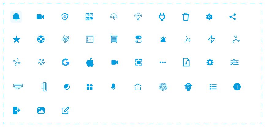
I partially used the icon set provided by Elmax, integrating more suitable new icons where needed to ensure visual consistency and semantic clarity.
UI components were defined following Material Design guidelines, adapted to the Elmax visual identity. Each component was designed to ensure consistency and usability across all interactive states.
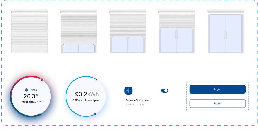
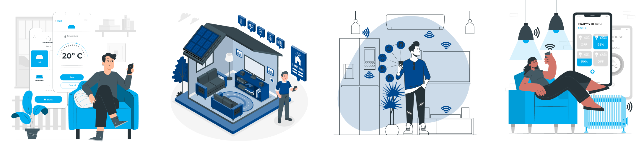
The illustrations were created to support empty states, onboarding and feedback moments within the app, maintaining consistency with the Elmax visual language.
Low-fidelity wireframes defined the structure and hierarchy of the main screens before moving on to high-fidelity design.
Low-fidelity mockups allowed the team to iterate quickly on screen structure and validate the main flows before investing in visual detail.
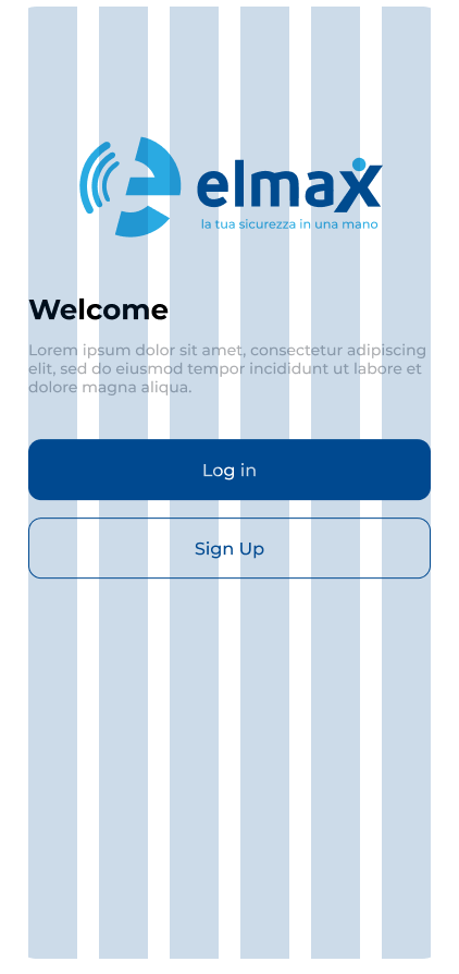
High-fidelity mockups show the final design of the Elmax interface, with all visual details, interactions and the design system fully applied.